


Loom Design System
Building a Scalable & Consistent Design System
MY ROLE
Conducted a comprehensive audit of the existing UI to assess inconsistencies and identify opportunities for improvement.
Researched leading design systems to gather insights and implement industry best practices.
Developed initial component and style guidelines to drive early adoption and ensure consistency.
Created key deliverables to advocate for the design system, secure stakeholder buy-in, and align resources for implementation.
As the lead designer for this project, I spearheaded efforts to execute the need for a design system which included:
PROJECT SCOPE
COLLABORATORS
Design Management
Design Team
Engineering Team
Product Management
ABOUT THE PROJECT
ABOUT THE PROJECT

Early documentation of repetitive components uncovered throughout Comfy’s products.
The Need for a Design System
Shortly after joining Comfy, I found myself spending a significant amount of time searching for past projects to understand the existing design direction. My goal was to align with current standards and avoid duplicating work that may have already been created. However, this process quickly revealed a major challenge—the organization lacked a single source of truth that both design and engineering teams could rely on for efficient collaboration.
Without a unified design system, the absence of clear guidelines led to poor usability, inconsistent UI, and a fragmented user experience across product streams. Teams operated with ambiguity, which not only slowed down development but also contributed to increasing technical and design debt over time..

The Problem
Key challenges included:
Lack of a shared foundation between product, brand, and engineering teams, leading to inconsistencies in design implementation.
Pre-existing design documentation (hosted in InVision) was vague and left room for misinterpretation.
No centralized design system, causing inefficiencies, redundant work, and a disconnected experience for end users.
CHALLENGES
Challenges Along the Way
Given the constraints of limited resources, we took an incremental approach to implementation. This allowed us to align the development of the design system with ongoing projects, ensuring that improvements were integrated seamlessly into existing workflows.
To prioritize which components to build first, I developed artifacts that outlined:
The specific problem each component aimed to solve.
The risk and effort associated with its development.
A roadmap for rolling out components in manageable phases
This method ensured that we could deliver immediate value while maintaining flexibility for future iterations.
Component Inventory & Prioritization – Conducted a comprehensive audit of components currently in use across products to align on priority needs.
Component Evaluation – Assessed existing components to determine which could be salvaged, deprecated, or redesigned based on usability best practices.
Audit of Deliverables – Reviewed design files and UI patterns to identify inconsistencies and opportunities for improvement.
To streamline design efforts and enhance consistency across products, I initiated key foundational tasks to unify the design team and eliminate redundant work. This phase focused on aligning teams, auditing existing components, and setting clear priorities for our component library. Key initiatives included
Staging the Foundation for a Unified Design System
These early steps laid the groundwork for a scalable, efficient, and cohesive design system, ensuring alignment across teams and products.

Early documentation of repetitive components uncovered throughout Comfy’s products.
Introducing Loom: Comfy’s Design System
With Comfy’s mission to connect employees to their office spaces and optimize their work environments, the Loom Design System was created to:
Ensure consistency across all products.A structured framework emerged, prioritizing learnability, adaptability, and efficiency.
Serve as a single source of truth for design components and patterns.
Support scalability as Comfy’s product ecosystem evolved.
Loom provided a structured yet flexible approach, balancing standardization with adaptability to meet the growing needs of the company.
LOOM HIGHLIGHTS
Atomic Design Components
A modular approach to UI design that enhances reusability and maintains consistency across products.
Scalability: Breaks down UI into reusable components, reducing redundancy.
Efficiency: Enables faster prototyping and development with pre-defined building blocks.
Consistency: Standardizes UI elements across teams, minimizing design drift.
Collaboration: Improves alignment between designers and developers with a shared component library..
LOOM HIGHLIGHTS
A11y / WCAG 2-Compliant Color Palette
Laying the foundation for an accessibility-first design system by prioritizing inclusive color usage.
Improved Readability: Ensures sufficient contrast for users with visual impairments.
Compliance with Standards: Meets WCAG 2.0+ guidelines to enhance accessibility.
Inclusive User Experience: Makes interfaces usable for a diverse range of abilities and needs.
Future-Proofing: Establishes a scalable color framework that supports continued accessibility improvements.

LOOM HIGHLIGHTS
4Pt Grid System
A structured layout system that ensures spacing and alignment remain precise and predictable.
Pixel-Perfect Precision: Establishes a visual rhythm for spacing, padding, and margins.
Responsive Adaptability: Simplifies scaling designs across different screen sizes.
Streamlined Handoff: Provides a clear structure for developers, reducing inconsistencies in implementation.
Cohesive Visual Design: Creates harmony across UI components for a polished and professional look..

THE JOURNEY
Establishing a Unified Vision
Understanding the growing inconsistencies between design and engineering, I prioritized the creation of a centralized design system to unify teams and streamline the development process. This required securing buy-in from stakeholders across multiple disciplines and advocating for a shared design language.
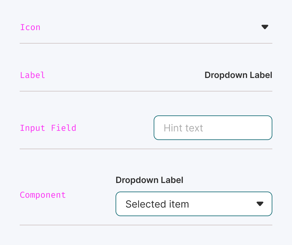
Building a Component Library
Developing resources that outlined why the system was necessary and the problems it aimed to solve.
Evangelizing the system through company-wide meetings and ongoing discussions.
Securing support from key stakeholders, including engineers and product managers, to ensure alignment.
With a clearer understanding of the gaps and redundancies, I initiated the development of a UI component library which our design team can begin to leverage in the meantime. This ensured:

THE JOURNEY
THE JOURNEY
Advocating for the Design System
A design system is only as valuable as its adoption. To drive engagement, I took on the role of a liaison between design, engineering, and product teams, continuously reinforcing its importance. This involved:
Designers had immediate access to standardized components, reducing ambiguity.
Future designs adhered to a cohesive visual and functional framework
Developers could efficiently implement reusable assets, cutting down on redundant work.
THE JOURNEY
Strategizing the Build Process
Given the constraints of limited resources, we took an incremental approach to implementation. This allowed us to align the development of the design system with ongoing projects, ensuring that improvements were integrated seamlessly into existing workflows.
To prioritize which components to build first, I developed artifacts that outlined:
The specific problem each component aimed to solve.
The risk and effort associated with its development.
A roadmap for rolling out components in manageable phases
This method ensured that we could deliver immediate value while maintaining flexibility for future iterations.
The Turning Point
As the system gained traction, we achieved key milestones that validated our efforts:
Dedicated design and engineering resources were assigned to support the initiative.
A structured framework emerged, prioritizing learnability, adaptability, and efficiency.
The component library became a trusted resource, ensuring UI consistency across all Comfy products.
A clear roadmap was established for ongoing development, guiding how we continued to refine the design system while building new applications in parallel.
ABOUT THE PROJECT
Impact
Add subtext and move toward end of case study.
✔ Reduce design and development ambiguity by creating a single source of truth.
✔ Increase consistency and accessibility across all products, incorporating accessibility standards into the system.
✔ Minimize design and engineering debt by leveraging reusable, scalable assets.
✔ Streamline collaboration between design, engineering, and product teams, improving the end-to-end development cycle.
✔ Empower contributors with clear guidance, documentation, and best practices for creating new components and features.
✔ Establish a company-wide framework for how design, collaboration, and product development should function.
By implementing a structured design system, Comfy aimed to improve product quality, efficiency, and the overall user experience while fostering a more cohesive and scalable approach to design and development.
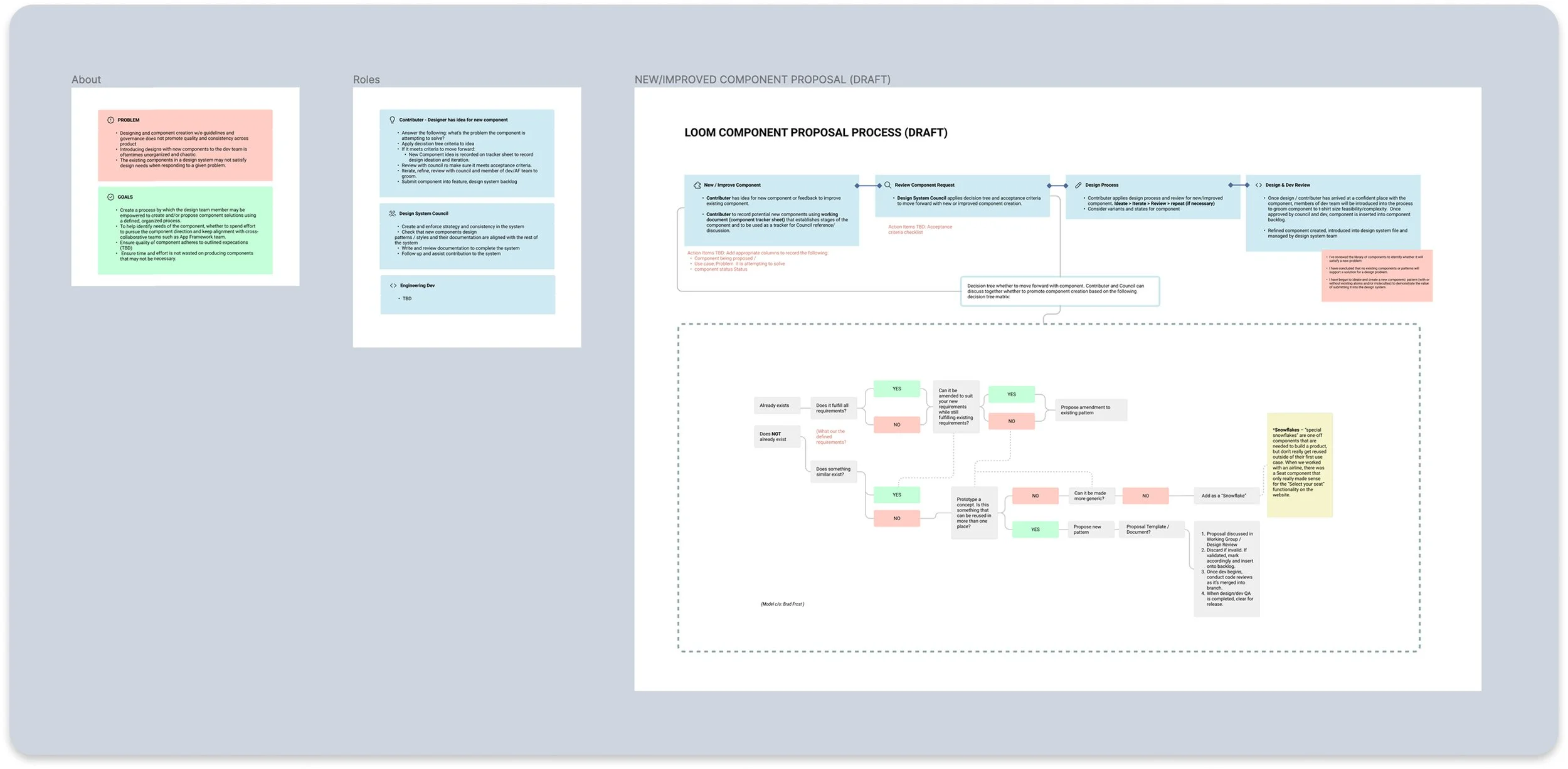
Ongoing Progress & Governance
To ensure the longevity and effectiveness of Loom, we implemented governance structures:
Defined roles (e.g., Contributors, Design System Council Members, Developers) to establish clear ownership.
A structured process for introducing and refining components, ensuring continuous improvement.
Comprehensive documentation to guide best practices and onboarding.
These measures helped foster a collaborative environment where Loom could evolve alongside Comfy’s products and teams.
Key Takeaways & Lessons Learned
Reflecting on this journey, several key insights emerged:
There is no one-size-fits-all approach to building a design system; adaptability is crucial.
Cross-functional alignment is essential—success depends on securing buy-in from all stakeholders.
Persistent advocacy pays off—a design system requires ongoing reinforcement to gain traction.
Collaboration across disciplines is fundamental to building a scalable and sustainable system.
Thinking holistically ensures that the system remains flexible enough to grow with the organization’s needs.
Building Loom was a transformative experience, reinforcing the importance of strategic coordination, clear documentation, and cross-team alignment. By prioritizing these elements, we created a scalable, efficient, and user-friendly design system that continues to drive consistency and innovation across Comfy’s product ecosystem.